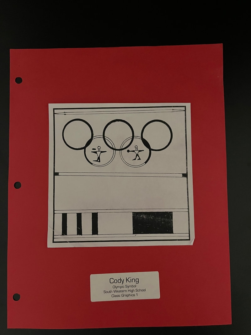
Considering that this was the first project that we had done in the class, I believe the main objective that Mr.Zeroth was shooting for was just to get a basis for our hand made artwork ability(get a general idea of what we can produce by hand before we move onto digital illustration). The reason my designe was like this was because I had track and field events, specifically field events. The field events consist of javelin, shotput, discus, and multiple versions of jumping. I wanted to make sure I included as many of those as I possibly could, and make sure the viewer could tell what they were easily. I like what I did with the Olympic symbol itself. The circles with the people in them are designed to look like actual throwing circles that throwers have to go into to perform their throws. I dislike how the people themselves turned out, they just look awkward to me and could have been done better.
