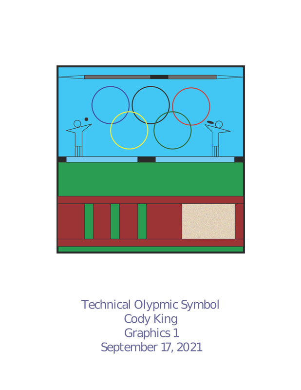
The main goal Mr.Zeroth set for this project I believe was just to enhance our hand version of our Olympic symbol and to get out feet wet so to speak with Adobe Illustrator. My thoughts for this project were to simply make it look better than the hand-drawn version, by adding color, texture, and other enhancements to make the project look better since I already liked the “foundation” of the hand-drawn version. My favorite thing about this project is probably the javelin and the pole vault. Unlike the hand-drawn version, I believe it is very easy to tell that there is a javelin at the top of the image and that the people are standing on the pole vault. I think putting the people on the pole vault was pretty clever because before it was just lines that served no value, as it didn’t look like much of a pole vault, so with a little bit of editing I turned it into something that helped demonstrate my topic. My least favorite part about this project is once again probably the people. I believe that they look better than the hand-drawn versions, but they still could have been better than what they were.
